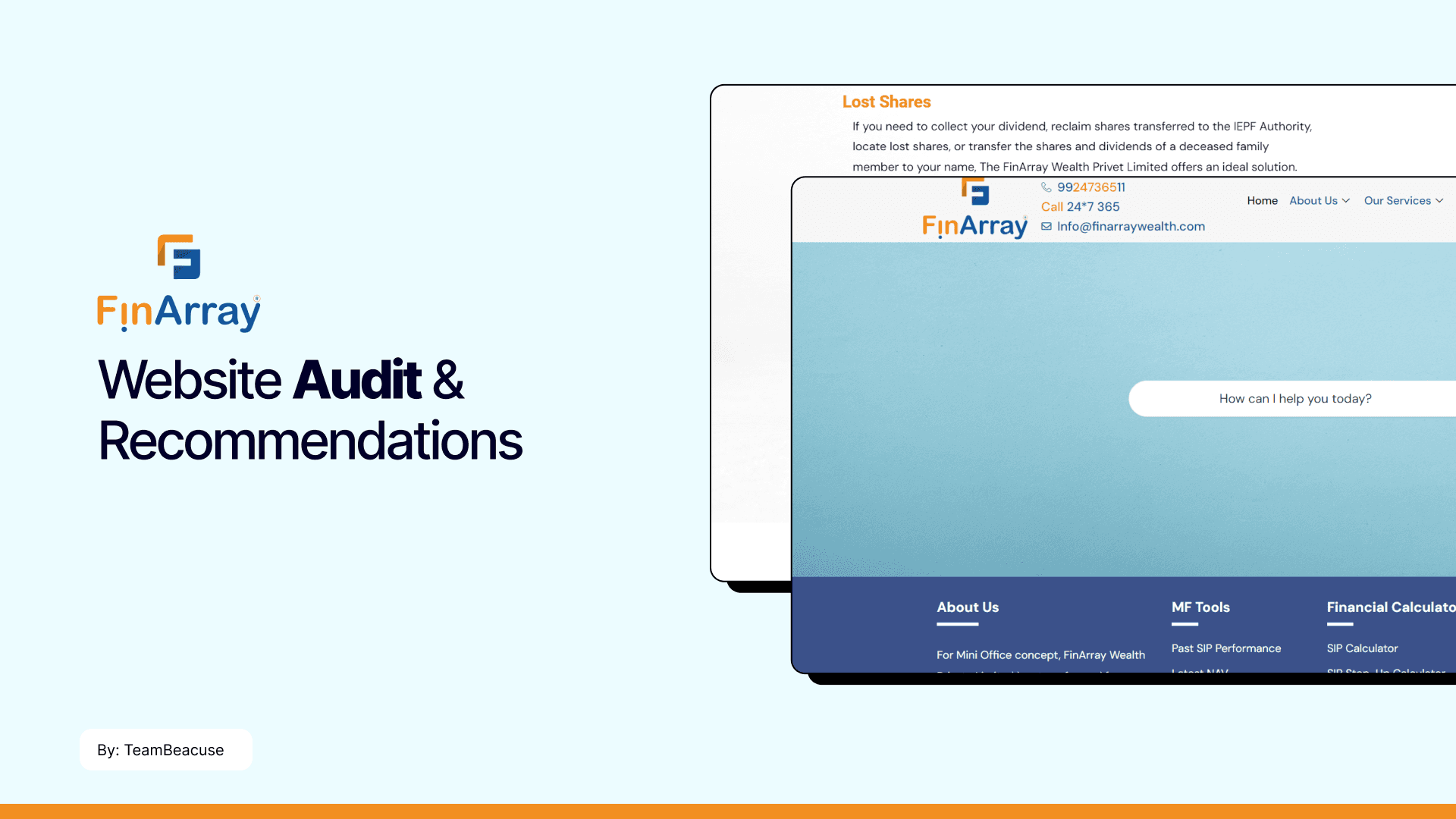
Website Audit & Recommendations

Industry Internship
Agency: Because-Branding & Marketing Agency
Simplifying Investment Journeys
Skills Applied
Heuristic Evaluation
User Journey Mapping
Competitive Analysis
Interaction Design Review
Timeline
1 week
In today's fast-paced world, managing investments should be seamless, intuitive, and empowering. But what happens when a financial website lacks clarity and ease of use? This is where our journey with Finarray began—transforming a complex, data-heavy platform into a streamlined digital experience.
Table of Contents
Starting with User Journeys
Usability Insights
The Design Approach
Pitching our Reccomendations
Final Thoughts on What I Learned
Starting with User Journeys…
Starting with a comprehensive audit, I analyzed the site structure, navigation patterns, visual elements, and content flow. The key questions guiding the audit were:
Is the website intuitive for new users?
Can users easily find the services they need?
Is the financial jargon simplified for broader audiences?
Does the design reflect trustworthiness and professionalism?
Usability Insights
We focused on the homepage and critical user journeys—signing up, exploring services, and accessing customer support. The findings revealed:
Visual Overload
Technical Jargon
Unintuitive Navigation
The Design Approach
We wanted to focus on user-centric simplicity and clean, digestible data
Pitching our Reccomendations
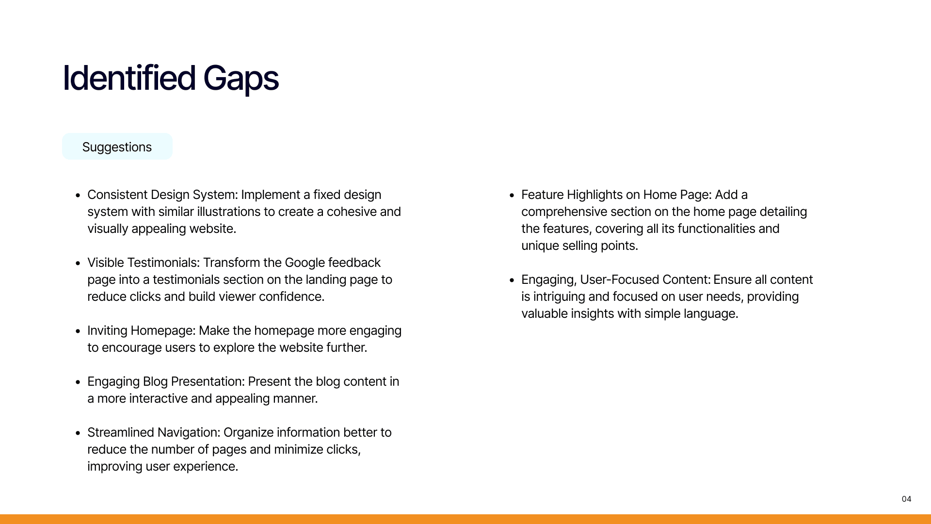
After gathering all insights, we crafted a series of actionable recommendations. The final deliverables were presented to the client in a pitch deck that summarized our findings and proposed improvements. Here's a glimpse of the key recommendations:
Simplified Navigation: We proposed restructuring the menu, reducing the number of categories, and creating clear signposts for high-priority actions.
Clear Call-to-Actions: To drive conversions, the CTAs needed to be prominent, consistent, and action-oriented, leading users directly to the next step in their journey.
Visual Hierarchy Revamp: By breaking down text-heavy sections into digestible chunks and adding more white space, we suggested a more breathable and user-friendly interface. This was paired with visuals that represented trust, security, and professionalism—core pillars of financial services.
Language Simplification: We recommended replacing complex financial jargon with accessible language, improving clarity for all types of users.


